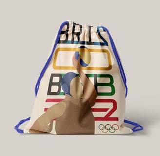
Case Study: Branding the 2032 Olympic Games in Brisbane
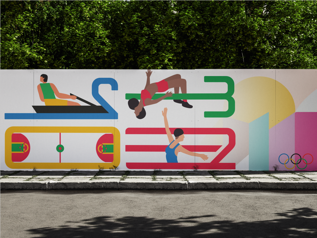
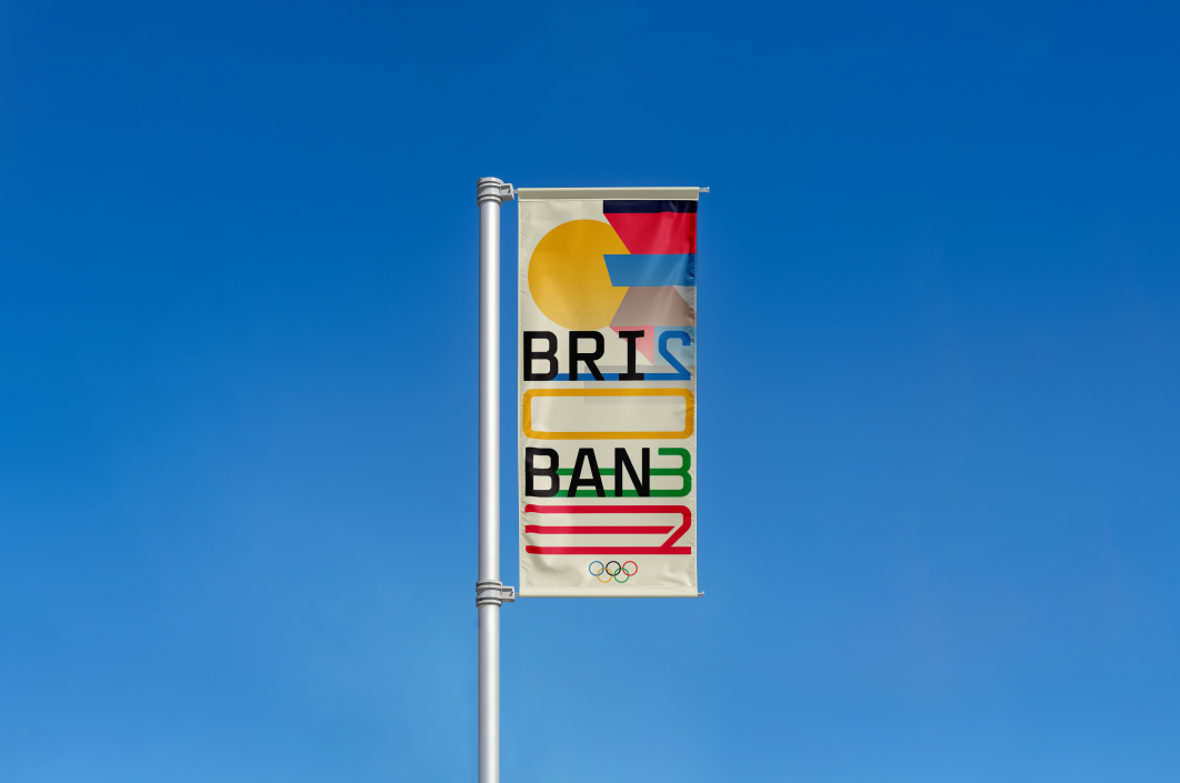
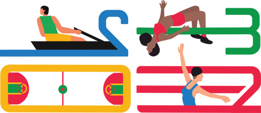
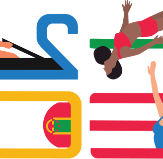
For my branding assignment for the 2032 Olympic Games in Brisbane, I incorporated kinetic type to evoke a sense of motion and energy, aligning with the dynamic spirit of the games. Extending the letters and numbers within the typography creates the illusion that they are part of various Olympic sports, such as the strokes through the water of rowing, the bar of a high jump, or the water in water polo. This approach brings the sports to life within the typeface and visually connects the event’s identity to the physicality and motion inherent in the Olympics.
Kinetic type offers a way to draw the eye across the design, creating fluidity and interest. This was crucial in making the visual identity dynamic and memorable, ensuring that each element interacted seamlessly with the others. By creating the typography in this way, I could mirror athletes' physical actions and agility, enhancing the engagement and emotional connection with viewers.
In line with the Olympic branding guidelines, I incorporated illustrations that help tell a story. These illustrations allow the design to express core Olympic themes, values, and symbols. By blending kinetic type with symbolic imagery, my goal was to create a design that resonates emotionally and intellectually with the audience, immediately conveying the essence of the games. I focused on finding the most direct and effective way to communicate what I wanted the audience to feel and understand, such as the unity, competition, and global celebration that the Olympics represent.
This approach celebrates the athleticism, movement, unifying spirit of the games, ensuring that the branding is not only aesthetically appealing but also reflective of the core values of the Olympics
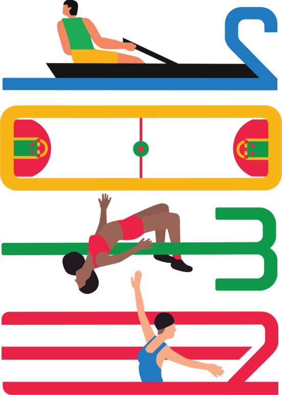

My design remains in harmony with the Olympic branding guidelines, particularly through its use of clean, bold, and readable typography that retains clarity. The colour palette and use of space adhere to the Olympic guidelines, ensuring that the design is instantly recognisable as part of the larger Olympic brand while allowing Brisbane’s unique identity to shine through with the number '0' which can be interpreted as the sun referencing to Brisbane being known as the sunniest city.
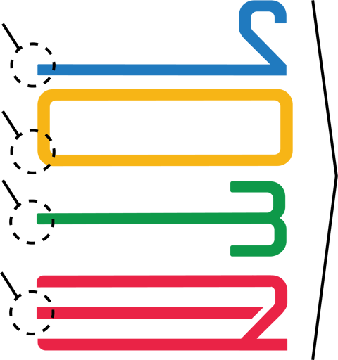
Water, Ocean, Regatta, Pool
Courts, Fields, Courses, Sun
Poles, Tracks, Bars
Finish lines, Tracks, Direction
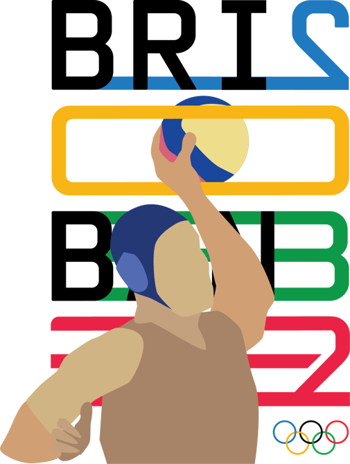
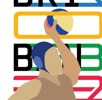
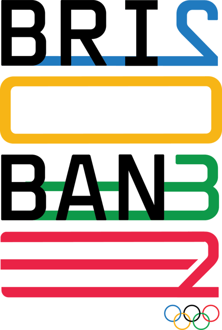
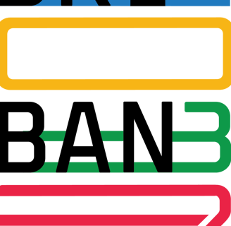
In my branding design for the 2032 Olympic Games, I used distortion kinetic typography to transform text into visual representations of motion and structure. By manipulating and distorting the shapes of letters and numbers, I created images that mirrored the physical movements associated with various Olympic sports. For example, extending the letters to resemble the water that strokes land in rowing or the poles of a high jump allows the typography to take on a dual function, both as readable text and as a visual metaphor for athletic action.
This technique of kinetic typography not only adds depth to the design but also enhances the viewer’s perception of movement and energy, elements that align with the Olympic spirit. The distortion introduces an organic flow, making the text seem alive and in motion, giving structure and form to the design without compromising clarity. This approach ensures that while the audience experiences the energy of the games, they also grasp the structural integrity of the branding, balancing creativity with functionality.


I chose to highlight the sun in my 2032 Brisbane Olympic branding to reflect Brisbane's reputation as the sunniest place on Earth, symbolising warmth, energy, and unity as it engulfs the city's silhouette.
